UI Layout
Every now and again, I get the urge to rethink the UI I use for WoW. I do this partly because I take the UI pretty seriously, and partly because I find tweaking the UI a lot of fun. It's like a whole little mini-game inside the game! WoW UI designers have a lot going for them. Like with most all Blizzard games, WoW features a very good API for introducing new features. And since there is such a ridiculously large player base, there are a lot of people out there producing UI mods and libraries to use. You can combine, and configure and even modify other peoples work to produce exactly what you personally like.
Initially when the collection of UI mods available was less extensive, I would find things that were similar to what I wanted and then crack open the scripts and edit them to my taste. I was able to get some pretty cool functionality very early before it became a standard part of most any UI nowadays, like player frames that smoothly changed color as health dropped, or spell school indications on the scrolling combat text. But hand-rolling scripts is pretty unnecessary now, and it's a lot of work to try and maintain your scripts through all the patches. Now I just gravitate towards very good mods that feature tons of configuration options as a raw base to work off of. Mods like Pitbull, Grid, and Satrina's Buff Frames are good examples.
My current UI layout is the product of lots of tweaks and trial and error. I've basically followed these principles:
I've spent a lot of time on keybinds and on finding good mods that meet my needs. But I realize that my basic layout could also use a bit of work. So I decided to really sit down and analyze how the UI is laid out on the screen. First I looked at my first principle: keep your character and surroundings clear. I created a mock-up of the screen showing about where the character would be and then tried to decide exactly where the most important parts of his 'surroundings' were.
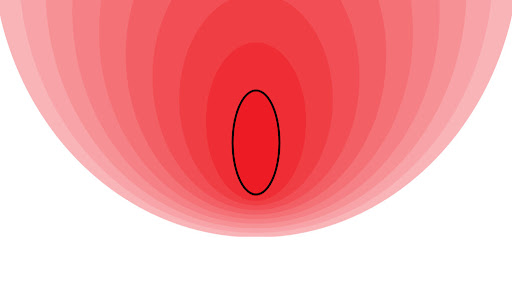
Here I've decided that you want to see out in front and to the sides of your character. Whats behind you is not really important, so long as you can see your feet clearly. Remembering that my zoom level can vary a lot, I tried to give some play to the bottom so that where my 'feet' are could vary.
Next I took the second principle: place important elements near the center of the screen. I laid out all the basic elements that I have in my layout using nondescript boxes that I could move around just like a floor plan. I needed a lot more boxes to get everything than I would've imagined when I started! I didn't even try to get things like combat text, extra action bars, or status bars, and it still took 24 boxes to layout the basic elements. I tried to let the color and thickness of the outlines indicate the relative importance of each box. The layout below is the one I am currently using.
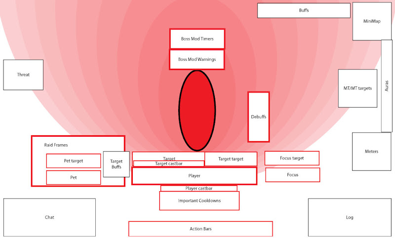
Looking at this I realize I've followed a few conventions that people have just gotten used to that don't make much sense. My combat log still sits where it is by default, taking up a lot of space even though I rarely look at it. I have Recount and various log analysis tools for that. I still need to see it, but I could make it a lot smaller. Castbars sit under the frame of the player they're attached to, just as they are in all player frame mods by default. However, they're a little hard to see since they are pushed right up against the target frames, and because I need to make them pretty thin to squeeze them in. These are way more important than I've given them credit my their placement.
What's going on over on the left is a bit of a problem too. The raid frames overlap the pet bars and target debuffs. The reason for this is that only my healer needs raid frames in this central position. And healers can't have pets and don't put debuffs up... except when they do. Sometimes I throw in a bit of DPS while healing and it's annoying not being able to see how long I have on moonfire or faerie fire. And in WotLK vehicles abound, which use the pet frames. So for example in Malygos phase 3, I can't see or target my dragon. I actually have to quickly grab and move my raid frames out of the way at the end of phase 2 to do so. I realize that my healer is going to need raid frames in a more prominent place than other characters, but I wanted a more elegant approach. So I tried to think of what elements would be more important to a non-healer that should take this real estate. There are two such elements: target debuffs and threat meters. Both tanks and DPS characters need to keep a constant eye on these, whereas healers only need to glance at them occasionally. So I should layout these in such a way that I can swap them. This is my only concession to my third principle: keep the UI consistent for all characters. Everything else is generic enough that it has about the same importance to all characters.
The area marked "important cooldowns" is actually a combination of Bartender and Satrina's Buff Frames that show the most important cooldowns and buff timers. It actually takes up more space than this since it can grow, but I realize that it is not laid out very efficiently and wastes some of the space at the bottom that isn't really used.
Debuffs I've placed right beside my character because I wanted them to be prominent. However in practice I hardly notice them and I think it's because the area I'm usually focused on is to the left and below my character, and these are on the opposite side. So i decided to move these over and make them grow upwards so I would be more likely to spot them as they appear. I'd even like to improve on this and make new debuffs pulse or flash or something, but I don't know of any mod that can do that. Any suggestions?
Moving blocks around my little example layout like this made me realize why a lot of people tend towards what I call a letterbox layout where they black out the entire bottom or top of the screen and fill the area with UI elements. Once you have a lot of blocks you want to fit efficiently in to a small space you start to tile them out. However I don't like the letterbox style because it violates my fourth principle: free up space when you don't need it. When I enter or leave combat, or join or leave a raid, I have various UI elements appear or disappear as I need and free up space to see the game world. I like it like this so I have tried to tile my UI elements out but leave it so they can fade out or disappear and still look decent. The finished product does look kind of letterboxy, but while just hanging out in Dalaran, nearly all those boxes disappear or fade out to leave the game world visible.
So here's what I ended up with.
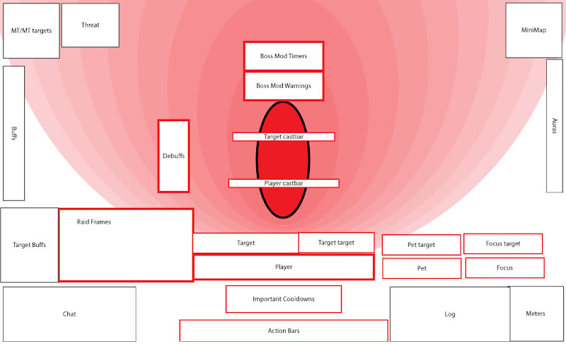
It's not a huge change. Like I say, my UI has gone through a lot of iterations so what I have I basically like. But there were a lot of tweaks made to try and improve it. By laying out the elements directly below my character a bit better I was able to free up just a bit more valuable space directly below my character's feet. I was able to get more stuff out of the way up top to get a clearer view into the distance. I've given castbars prime real estate. It should be much more recognizable when a boss starts a cast. I may even put focus target castbars up there somewhere if I find I need them.
When I actually tried to put the layout into effect, I found that by clearing up some space, I was even able to make important elements a little larger, or put a little more information on than I had before.
Next I'll try it out and see how I like it and if I need to tweak it bit. Then I'll get some screenshots up to see how the entire design process plays out.
Initially when the collection of UI mods available was less extensive, I would find things that were similar to what I wanted and then crack open the scripts and edit them to my taste. I was able to get some pretty cool functionality very early before it became a standard part of most any UI nowadays, like player frames that smoothly changed color as health dropped, or spell school indications on the scrolling combat text. But hand-rolling scripts is pretty unnecessary now, and it's a lot of work to try and maintain your scripts through all the patches. Now I just gravitate towards very good mods that feature tons of configuration options as a raw base to work off of. Mods like Pitbull, Grid, and Satrina's Buff Frames are good examples.
My current UI layout is the product of lots of tweaks and trial and error. I've basically followed these principles:
- make sure your character and immediate surroundings are always clear and in focus
- put more important UI elements nearer the center of the screen
- as much as possible, have one consistent UI that works for all characters and all roles
- keep the screen clean and have elements disappear when they have no immediate value
I've spent a lot of time on keybinds and on finding good mods that meet my needs. But I realize that my basic layout could also use a bit of work. So I decided to really sit down and analyze how the UI is laid out on the screen. First I looked at my first principle: keep your character and surroundings clear. I created a mock-up of the screen showing about where the character would be and then tried to decide exactly where the most important parts of his 'surroundings' were.
Here I've decided that you want to see out in front and to the sides of your character. Whats behind you is not really important, so long as you can see your feet clearly. Remembering that my zoom level can vary a lot, I tried to give some play to the bottom so that where my 'feet' are could vary.
Next I took the second principle: place important elements near the center of the screen. I laid out all the basic elements that I have in my layout using nondescript boxes that I could move around just like a floor plan. I needed a lot more boxes to get everything than I would've imagined when I started! I didn't even try to get things like combat text, extra action bars, or status bars, and it still took 24 boxes to layout the basic elements. I tried to let the color and thickness of the outlines indicate the relative importance of each box. The layout below is the one I am currently using.

Looking at this I realize I've followed a few conventions that people have just gotten used to that don't make much sense. My combat log still sits where it is by default, taking up a lot of space even though I rarely look at it. I have Recount and various log analysis tools for that. I still need to see it, but I could make it a lot smaller. Castbars sit under the frame of the player they're attached to, just as they are in all player frame mods by default. However, they're a little hard to see since they are pushed right up against the target frames, and because I need to make them pretty thin to squeeze them in. These are way more important than I've given them credit my their placement.
What's going on over on the left is a bit of a problem too. The raid frames overlap the pet bars and target debuffs. The reason for this is that only my healer needs raid frames in this central position. And healers can't have pets and don't put debuffs up... except when they do. Sometimes I throw in a bit of DPS while healing and it's annoying not being able to see how long I have on moonfire or faerie fire. And in WotLK vehicles abound, which use the pet frames. So for example in Malygos phase 3, I can't see or target my dragon. I actually have to quickly grab and move my raid frames out of the way at the end of phase 2 to do so. I realize that my healer is going to need raid frames in a more prominent place than other characters, but I wanted a more elegant approach. So I tried to think of what elements would be more important to a non-healer that should take this real estate. There are two such elements: target debuffs and threat meters. Both tanks and DPS characters need to keep a constant eye on these, whereas healers only need to glance at them occasionally. So I should layout these in such a way that I can swap them. This is my only concession to my third principle: keep the UI consistent for all characters. Everything else is generic enough that it has about the same importance to all characters.
The area marked "important cooldowns" is actually a combination of Bartender and Satrina's Buff Frames that show the most important cooldowns and buff timers. It actually takes up more space than this since it can grow, but I realize that it is not laid out very efficiently and wastes some of the space at the bottom that isn't really used.
Debuffs I've placed right beside my character because I wanted them to be prominent. However in practice I hardly notice them and I think it's because the area I'm usually focused on is to the left and below my character, and these are on the opposite side. So i decided to move these over and make them grow upwards so I would be more likely to spot them as they appear. I'd even like to improve on this and make new debuffs pulse or flash or something, but I don't know of any mod that can do that. Any suggestions?
Moving blocks around my little example layout like this made me realize why a lot of people tend towards what I call a letterbox layout where they black out the entire bottom or top of the screen and fill the area with UI elements. Once you have a lot of blocks you want to fit efficiently in to a small space you start to tile them out. However I don't like the letterbox style because it violates my fourth principle: free up space when you don't need it. When I enter or leave combat, or join or leave a raid, I have various UI elements appear or disappear as I need and free up space to see the game world. I like it like this so I have tried to tile my UI elements out but leave it so they can fade out or disappear and still look decent. The finished product does look kind of letterboxy, but while just hanging out in Dalaran, nearly all those boxes disappear or fade out to leave the game world visible.
So here's what I ended up with.

It's not a huge change. Like I say, my UI has gone through a lot of iterations so what I have I basically like. But there were a lot of tweaks made to try and improve it. By laying out the elements directly below my character a bit better I was able to free up just a bit more valuable space directly below my character's feet. I was able to get more stuff out of the way up top to get a clearer view into the distance. I've given castbars prime real estate. It should be much more recognizable when a boss starts a cast. I may even put focus target castbars up there somewhere if I find I need them.
When I actually tried to put the layout into effect, I found that by clearing up some space, I was even able to make important elements a little larger, or put a little more information on than I had before.
Next I'll try it out and see how I like it and if I need to tweak it bit. Then I'll get some screenshots up to see how the entire design process plays out.